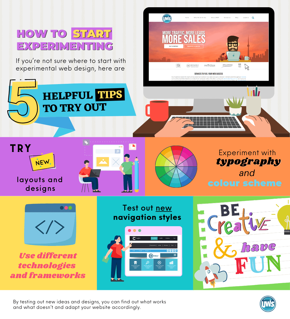
There’s a reason why businesses often stick to tried and true web design practices: because they work. But there’s also a reason to experiment, try new things, and see what might be possible if you push the boundaries. That’s where experimental web design comes in. By testing out new ideas and designs, you can find out what works and what doesn’t and adapt your website accordingly. This blog will talk about why not to be afraid to experiment – it could lead to some big improvements for business!
Experimenting Defies Traditional Layouts
Conventional web layouts are easy to spot. The homepages typically have a large header area with the navigation bar right below it. Then there’s usually the main body area where most of the content lives, followed by a sidebar and/or footer. If you were to ask someone to draw you a website, this is probably what they would sketch out. And while there’s nothing wrong with traditional layouts, sometimes it pays to break the mold and try something new. Experimental web design is all about testing out new ideas and seeing what works.
Grid System
One popular trend in experimental web design is breaking up the traditional layout and instead using a grid system. This means that instead of having one large body area, the content is broken up into smaller sections that are arranged in a grid. This can be a great way to organize content and make it more visually appealing. It can also make your website more responsive, as the content will resize itself depending on the screen size.
A grid system is known as a basic foundation for web design. It divides a webpage into columns and rows, making it easy to place content in specific locations. Grid systems can be custom-made or use pre-made templates. They’re popular because they make creating websites easier, as everything is already laid out for you. Plus, they create a cohesive look across all the pages of your website. If you’re interested in experimenting with web design, using a grid system is a great way to start!

Parallax Scrolling
Another trend that has been gaining popularity lately is parallax scrolling. This is where the background image moves at a different speed than the rest of the page, creating a sense of depth and movement. This can be a great way to add visual interest to your website and make it more engaging for visitors.
There are a few reasons why you might want to consider using parallax scrolling on your website: first, it can be visually appealing and help grab people’s attention; second, it can be used to direct focus to certain areas or content on the page; and third, it can add some interactivity and excitement to a website.
However, there are definitely times when parallax scrolling is not appropriate – for example, if you’re looking for a minimalist design or your website needs to be accessible on mobile devices. You should also avoid it if you’re worried about user experience, as it can be confusing and overwhelming for some people.
If you decide that parallax scrolling is right for your website, there are a few different ways to go about implementing it. You can use HTML and CSS to create the effect manually, or various plugins and frameworks are available that will do the heavy lifting for you.
These are just two examples of experimental web design trends that you could try out for your business. Of course, there are endless possibilities, and you should feel free to experiment with whatever you think might work. Just be sure to test everything out first to make sure it’s actually effective. Otherwise, you could end up making some changes that aren’t really necessary.
Push The Limits
Each day we perform actions that are so routine we barely register that we are doing them. Scrolling on a website gets no more thought than pushing an elevator button. Experimental web design challenges us to work outside those instincts. When thinking of your customers, they will remember your site because it pushed them to get outside their routine actions.
A site with an experimental design may ask customers to scroll horizontally or direct them to hold down the space bar to explore content. While these design elements can be viewed as playful, it is important to remember that they may also make a website less accessible. Building a website with the right accessibility and experimentation can be a challenge, but it is possible.
The Bottom Line
Don’t be afraid to experiment – it could lead to some big improvements for your business! By trying out new ideas and designs, you can find out what works and what doesn’t, and adapt your website accordingly. So go ahead and have some fun with experimental web design – the possibilities are endless!
Contact us today for information on Unwired Web Solutions custom web development or custom web app development!


